



The sky was as Prussian blue as Potsdam could require, but it was yet more like that lavish and glowing use of the color which a child extracts from a shilling paint box.
—G.K. Chesterton
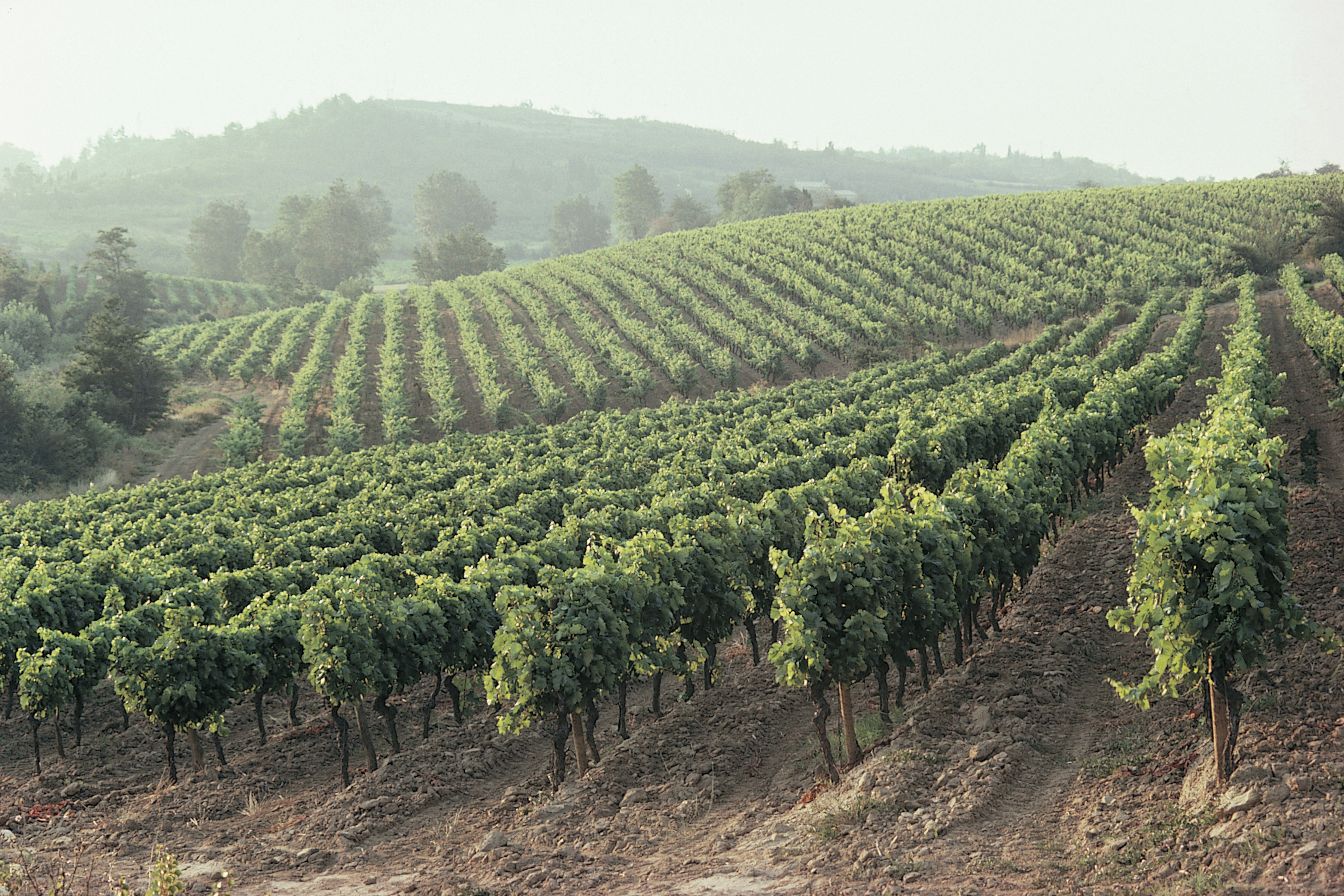
It was a destination birthday party — an important birthday — a 50th birthday. Winding along the rural roads of Sonoma County on a sunny afternoon, we saw countryside dotted with shabby cottages, mom and pop businesses, roadside vegetable stands. Wide swaths of vineyards crisscrossed the landscape like giant checkerboard lines.
Down a bumpy dusty narrow lane a house emerged out of the hillside. A beautiful, elegant Craftsman, it should have been out of place amid its more modest neighbors, but it wasn’t. The wraparound deck, filled with revelers, looked across the valley to distant hills wearing rows of grape vines like exotic jewelry. Other guests wandered the grounds. This must be how Gatsby felt when he looked across the water, I thought. Fitzgerald’s world had its own surprises — so did the house before me.
***
The host, the husband of the man whose birthday we were celebrating, took us on a tour. The colors were warm, subtle, muted. Both men had demanding jobs. I knew enough about color to know these had been chosen to create the restful, quieting influence browns and greens elicit. The sightlines and room dimensions were precise. Turning a corner, I found a spectacular large, exuberant many-colored canvas. Against the measured subdued backdrop it was even more captivating. An attractive woman, wearing the turban that said she was fighting cancer, stood nearby. “Do you like it?” she asked.
“It’s staggering. It looks alive.” I said.
“It is alive,” she smiled. “I should know. I painted it.”
***
Tole painters select a color scheme as one of their first determinations in developing a design. China painters reverse the process. They focus first on the design — using color to reinforce it. Either way requires a knowledge of color theory — something I knew nothing about early on — a fact not obvious in my finished work because I pestered teachers to tell me what colors to use. It was a handicap beyond painting.
Decorating from scratch is like facing blank canvas. Color schemes came and went, in ways I never understood. In the 1970s everything was “harvest gold” and “avocado green.” I dutifully set about staining unfinished wood in colors I saw in magazines and department stores, scouring yard sales, replacing carpet. As I was priming the rural mailbox I intended to paint green — not for mail, for storing bread on the kitchen counter — a senior professor’s stylish wife paid her first visit.
“I see you like green and gold,” she said. Actually, I didn’t; but magazines said I should. “Too bad,” she continued. “The new colors are colonial blue and burgundy.” University communities can be small worlds. I didn’t want to be out of sync. Bad form. Discouraged, I called a department store that offered “complimentary interior decorating evaluations.”
I cleaned and polished every green and harvest gold surface, wondering why it was called harvest gold when it looked like hotdog mustard yellow. “Out of style. We’ll see about that,” I thought. The woman arrived, clipboard in hand. Colonial blue dress. Burgundy shoes. She strode from room to room like a general inspecting troops. Forehead wrinkled, lips pursed, she made small huffing sounds as she wrote. Finished, she cleared her throat. “One word comes to mind seeing your home.” She paused for effect. “Insipid.”
“Call me when you are ready to redo…everything.”
Insipid? I wasn’t sure what the word meant but I knew it wasn’t a compliment. I checked the dictionary. It said, “Without distinctive, interesting, or stimulating qualities. Vapid. Dull. Uninteresting.” I had to admit it was a good choice for avocado green. I knew what I didn’t like: avocado and harvest gold, always feeling out of step, chasing fashion trends someone else decreed. I was less sure what I did like.
***
I began studying. No two people see color the same way. It is a visual sensation. Even your left eye sees different from your right. I enrolled in a color theory course based on the work of a decorative arts master painter, Ann Kingslan. For months we focused on color schemes — monochromatic, analogous, complementary, split complementary, double split, triadic. We applied the concepts in a polychromatic painting using all the colors called “The Vegetable Cupboard.” Squash, peas, carrots, parsley, beets, peppers, eggplant, mushrooms, radishes.
The light we perceive as originating from the sun contains all the colors and is actually white. We created our own color wheels. We learned about color “families.” I began to appreciate what happens when opposite colors on the wheel are mixed — you get gray. I began to understand the psychology of color, the seasons of color, the religious symbolism of Pennsylvania Folk Art — red for charity, blue for truthfulness, purple for sorrow. More important, I began to develop my own sense of how I wanted to use color in painting and at home.
***
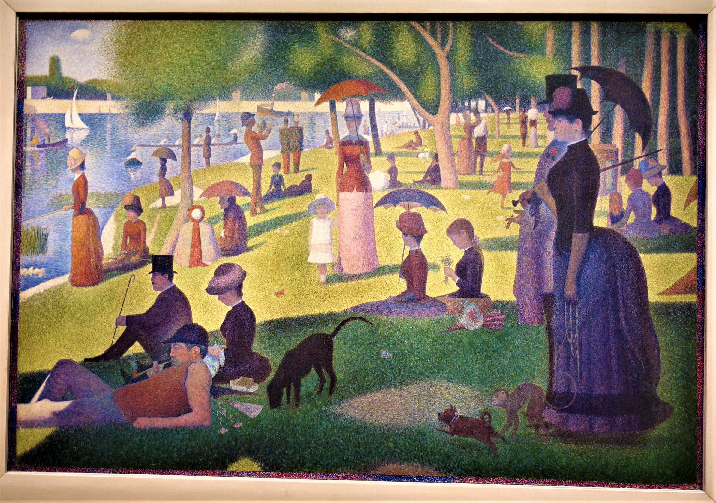
A chance visit to the Art Institute of Chicago several years later brought me face to face with Georges Seurat’s “Sunday Afternoon on the Island of La Grande Jatte.” I was mesmerized. Every color in the rainbow danced across the large canvas. Ladies with parasols strolled in the sun, children and puppies played on the grass, sailboats moved along, men lounged in the shadows. Seurat, a student of color theory, decided if he used miniature dots instead of brush strokes an optical illusion would merge them into single, more vivid images.
He worked on the canvas for two years. In the process he became the father of pointillism. The color and vitality captured what I was looking for — a celebration of life in many colors, not just passing fads. Today a 4-by-4’ print of the painting is the focal point in our dining room. The room is the setting for many gatherings, the picture an invitation — “Come in. Your color adds to our story. Welcome.”
***
The Pantone Color Institute is considered the global authority on color. They establish the standards for its use in manufacturing and printing. Their Color Matching System means a shade of blue used in fabric in Brazil and wall paint in the United States will match exactly. Their job is to figure out the collective color mood of the world. When they do, it is announced in the form of Pantone’s Color of the Year. In 2012 Tangerine Tango danced into the spotlight. That means people will see it in everything from accent walls to furniture to clothing.
Leatrice Eiseman, Pantone’s spokeswoman and instrumental person in the selection process, studied psychology before coming to work at the Institute. About tangerine, she says, “The color is more complex than red — with a ‘come-hither’ attitude.” Magazines are showing tangerine knobs and pulls, bathtubs, kitchen counters.
I have studied color psychology too. Orange also produces hyperactivity. Do people really want hyperactive kitchen counters? I suspect the long-ago decorator I called is pushing orange disguised as tangerine this year. Someday Pantone will get back to avocado. And everyone will follow. After all, in 2009 they chose Mimosa, which looked like yellow and arrived on the heels of Michelle Obama’s citrus inauguration suit. A symbol of optimism, it washed over the country. By 2010 it was out of fashion.
***
G.K. Chesterton is the creator of what is regarded as the second most successful detective creation in English literature after Sherlock Holmes — Father Brown. The 53 stories featuring the peculiar cleric are famous for many reasons: not only for the character he created, but his use of color in creating word pictures. Opening any story the reader finds poetic writing: The evening daylight in the streets was large and luminous, “The Man in the Passage”; He was called by his intimates Mulberry in apt allusion to something rich and fruity about his dark rotundity and rather empurpled visage, “The Vampire of the Village.”
The brilliant description is not surprising. Chesterton was a talented artist trained at the Slade School of Art, one of the most important schools in the world in the late 19th and early 20th centuries.
He was also a student of human nature. In “The Queer Feet” he says, In the heart of a plutocracy tradesmen become cunning enough to be more fastidious than their customers. They positively create difficulties so that their wealthy and weary clients may spend money and diplomacy in overcoming them. He wrote that in 1911. Many things have changed the last 100 years. That has not. Sadly.
***
The 50th birthday party celebration continued into evening. I sought out the painter to learn more about her and her color choices. Her name was Terri Hill. “I was a graphic designer for three decades,” she said.
“I began painting fulltime on New Year’s Day, 2009, after my cancer diagnosis. Painting helps me appreciate every minute. I like unusual vantage points and rich, saturated colors. Red and green are complementary in the picture you like. Red is exciting, healthy, warm. It’s a symbol of resilience. Green is hopeful.”
Terri Hill chooses colors based on her knowledge of art, design, and emotion. So did Georges Seurat. So did F. Scott Fitzgerald.
Gatsby believed in the green light, the orgastic future that year by year recedes before us. It eluded us then, but that’s no matter — tomorrow we will run faster, stretch out our arms farther…And one fine morning…
In Pennsylvania Dutch folk-art, green is the color of eternal life, the color of renewal. Fitzgerald ends “The Great Gatsby,” We beat on, boats against the current, borne back ceaselessly into the past. But there is a way forward. It’s Gatsby’s green light. Spring comes. With it the colors of the rainbow burst out.

***
We live in a community with many Hindus. They celebrate Holi, the throwing off of winter gloom. Neighbors rejoice in the liveliness of a new season on the day of a March full moon. It is a festival of fun and merrymaking. People decorate each other’s faces and clothes with colored chalk — every color on everyone. For one day there are no castes, no barriers between people.
Many Christians dye Easter eggs. We do. Celebrants wear white robes on Easter Sunday — the color that contains all in one. No barriers.
***
Georges Seurat, G.K. Chesterton, Terri Hill — different mediums, different generations, different styles. All with the same love for color and its power. Power to soothe and shape. Power to catapult, console, connect the human experience.
I don’t need a decorator these days. Ours is a house of many colors. Many more are in my paint box. There are thirty-one variations of green — even avocado.
Celebrating life. In every shade.


